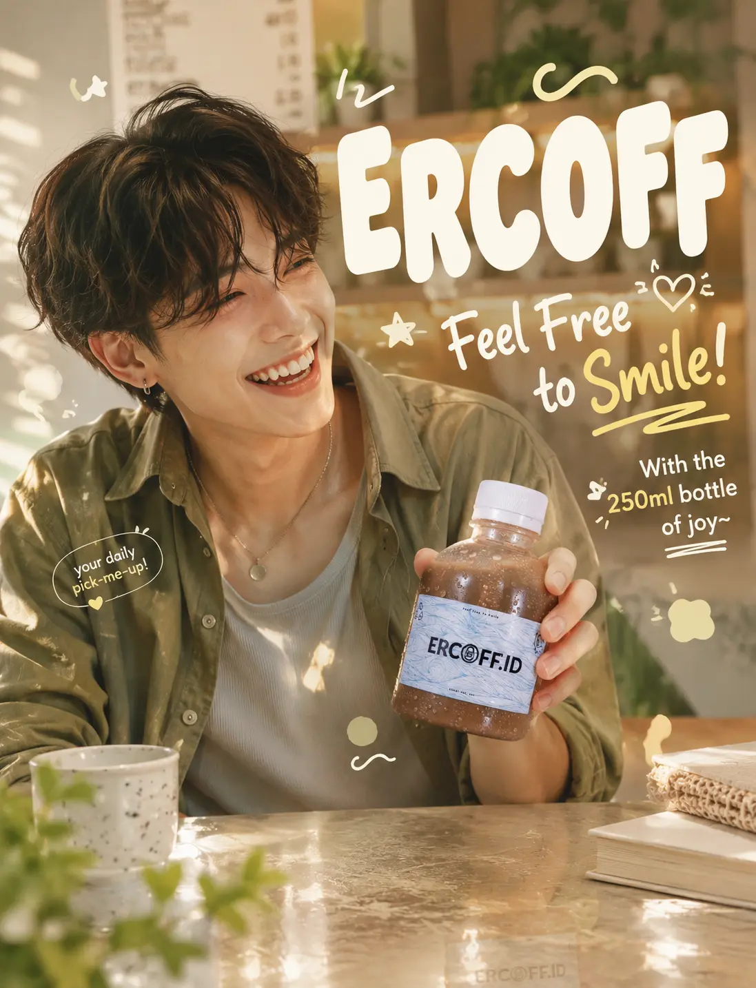
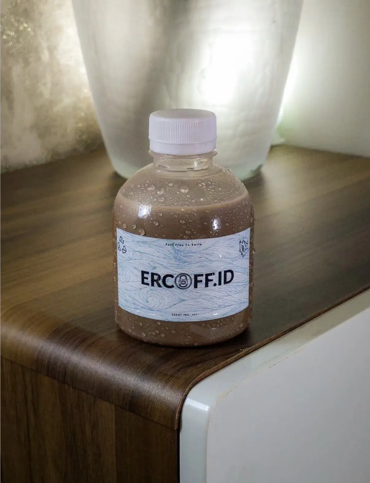
Use the attached product photo as the base. Analyze the dominant color of the bottle and label before proceeding:

— If the dominant color is GREEN or MATCHA TONE: apply a matcha Gen-Z café creative direction. Background suggests the interior of a bright, airy café — soft warm white walls, hint of wooden shelving or pastel tile, dappled natural light streaming through an unseen window. Overlaid with vivid matcha green color wash and soft particle scatter. Floating elements: green tea leaves mid-spin, small ceramic cup silhouette or saucer shape as a subtle prop detail, star and blob shapes in chalk white and pale gold drifting through the frame. Color palette: vivid matcha green, warm white, pale lime, honey wood tone, warm gold pop.

— If the dominant color is BROWN or CHOCOLATE TONE: apply a chocolate Gen-Z café creative direction. Background suggests a cozy café corner — warm terracotta walls, soft shadows from hanging pendant lights, hint of a marble countertop or worn wooden table edge. Overlaid with warm cacao color bloom and subtle grain texture. Floating elements: cacao nibs mid-scatter, small ceramic cup or spoon silhouette as prop detail, playful blob and squiggle shapes in cream and warm yellow floating through the frame. Color palette: rich chocolate, terracotta, warm cream, soft peach, amber light glow.

— If neither green nor brown is dominant: apply a neutral Gen-Z café creative direction. Background suggests a softly lit café interior with warm ambient light. Match accent colors to the bottle's dominant color. Floating elements include abstract playful shapes, fine particle scatter, and subtle café prop silhouettes — cups, saucers, small plants — that feel light and decorative rather than literal.

Regardless of direction: the café environment should feel suggested and atmospheric, not photorealistic or cluttered. Think mood board — soft bokeh background depth, warm ambient light, a sense of place without a full scene. Keep the bottle exactly as it appears — do not alter the label, shape, packaging design, or branding. Enhance condensation droplets on the bottle surface for a fresh, just-grabbed feel. Add a soft reflective surface beneath the bottle, as if resting on a café table. Do not add any powder burst, powder mist, or powder explosion effects of any kind.

Introduce a fictional human figure into the composition as a key visual element. The figure is a young adult, early 20s, androgynous features, radiating effortless cool with a joyful undercurrent — at home in a café, the kind of person who makes sitting alone look interesting. The figure interacts with the product in a candid, unposed way: mid-laugh while holding the bottle across a café table, tilting it playfully toward the camera, or caught in a spontaneous bright moment — as if a friend just said something funny mid-sip. Outfit: smart-casual Gen-Z café aesthetic — linen overshirt, soft knit, or a cropped graphic tee layered under a relaxed blazer, in earth tones or soft pastels that complement the active color direction. Expression: genuine smile, mid-laugh, or bright-eyed playful surprise — alive, warm, uncontrived. The figure occupies one side of the frame with natural presence, leaving clear space for the product as hero.

Anatomically correct proportions, natural shoulder width, realistic torso length, arms reaching mid-thigh, 5 fingers per hand with natural knuckles and 2-joint thumbs, head-to-body ratio 1:7.

Integrate the following brand elements as typographic overlays:

BRAND NAME: ERCOFF
SLOGAN: Feel Free to Smile!
PRODUCT INFO: With the 250ml bottle of joy~

Typography style: bold rounded sans-serif or bubbly condensed display font for brand name, loose hand-influenced lettering or wavy baseline for slogan, small clean utility typeface for product info. Layout is asymmetric and energetic — slight rotation on the slogan, playful spacing, color contrast between text layers. Typography color pops against the active creative direction without clashing. Overall text composition should feel like a café chalkboard reimagined as a Gen-Z poster.

Retouch to match vibrant Gen-Z editorial advertising standards — clean but characterful, slightly boosted saturation, warm and inviting contrast. Soft natural window lighting with warm café ambient glow. Photorealistic textures throughout. 8K quality output, ultra detailed.

Do not change the bottle. Only enhance the environment, lighting, atmosphere, fictional figure, and brand text layer around it.