Use the attached photo as the face and body reference for the subject. Preserve the subject's exact facial bone structure, skin tone, eye shape, and facial features across the entire image. Expression is free to adapt to the theme.
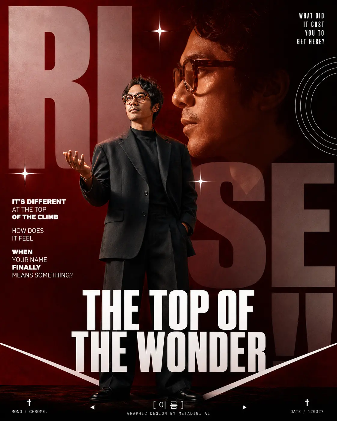
Create a bold editorial graphic poster in 4:5 ratio, inspired by Korean music album art and high-concept graphic design. The overall mood is TRIUMPHANT — a visual anthem of hard-earned achievement.
---
LAYOUT STRUCTURE:
BACKGROUND LAYER:
Fill the entire canvas with an oversized typographic composition. The word "RISE" is broken across the frame — "RI" on the upper left, "SE" partially cropped at center-right, "!!" bleeding off the bottom edge — each letter rendered in massive ultra-bold condensed sans-serif (similar to Impact or Bebas Neue), in solid white with 15% opacity, layered over a deep crimson-to-black gradient background (#8B0000 to #1a1a1a). Behind the letters, place a large ghosted close-up of the subject's face in strict side profile (90-degree lateral view, facing left) — jaw set, gaze fixed forward at something unseen, expression radiating quiet but iron-strong determination. Dramatically lit with warm amber catching the forehead, nose bridge, and chin; deep shadow swallowing the back of the skull. Rendered as a semi-transparent layer integrated into the background so it reads as a monumental inner force looming behind the present-day figure.
ACCENT ELEMENTS:
Scatter 3–4 sharp 4-pointed star glints (white, crisp, geometric) across the composition — one near upper-center, one at mid-left, one near the subject's shoulder. Add one concentric circle graphic (thin white lines) at the right edge, partially cropped.
SUBJECT — FULL BODY:
The subject stands slightly left of center, full body visible from head to toe, rendered as a clean photographic cutout integrated into the scene (not floating — feet touch the ground plane of the poster).
FIGURE DETAILS:
- Angular yet soft facial features, defined jawline without hyper-masculine or feminine markers
- Medium build, natural proportions
- Short-to-medium hair, styled with a quiet confidence
- Outfit: a tailored oversized blazer in deep slate or charcoal, worn over a structured mock-neck top, paired with wide-leg trousers in the same tone — structured and form-neutral
- Posture: standing with one hand slightly raised, palm open — as if receiving or acknowledging something; shoulders relaxed but chest open, head turned slightly upward
- Expression: quiet pride — not grinning, but resolved, composed, warm
ANATOMY LOCK: exactly 5 fingers per hand with natural knuckle structure, thumb with 2 joints, 1:7 head-to-body ratio, natural shoulder width, realistic torso length, arms reaching mid-thigh. Anatomically correct proportions throughout.
FOREGROUND TEXT:
Upper right corner (small, uppercase, white, tight tracking):
"WHAT DID
IT COST
YOU TO
GET HERE?"
Left side (stacked, small caps, white):
Line 1 (bold): "IT'S DIFFERENT"
Line 2: "AT THE TOP"
Line 3 (bold): "OF THE CLIMB"
Line 4: "HOW DOES"
Line 5: "IT FEEL"
Line 6 (bold): "WHEN"
Line 7: "YOUR NAME"
Line 8 (bold): "FINALLY"
Line 9: "MEANS SOMETHING?"
CENTER-BOTTOM (large, bold, white, condensed, alignment center):
"THE TOP OF
THE WONDER"
FOOTER BAR:
At the very bottom, a thin horizontal white rule separates a dark footer strip. Inside the footer:
- Far left: a small cross/dagger symbol (†) with the word "MONO / CHROME." beneath it
- Center: the subject's name in Korean-style typography or clean serif (leave a placeholder: [이름]) with the label "GRAPHIC DESIGN BY METADIGITAL" below
- Far right: a cross symbol (†) with the words "DATE / 120327" beneath it
- Small left-pointing triangle (◄) and right-pointing triangle (►) flanking the center name, spaced symmetrically
FOOTER CHEVRON:
Just above the footer bar, draw a downward-pointing chevron/arrow shape in white (like an inverted V) framing the subject's feet — echoing the original layout structure.
---
COLOR GRADING:
Overall palette: deep crimson (#8B0000), near-black (#111111), warm amber for skin highlight, pure white for all text and graphic elements. Subject is color-graded to feel part of the scene — warm red-amber cast on skin, slight shadow on the far side of the face.
RENDERING STYLE:
High-contrast editorial poster. Photographic subject quality. Typographic elements are crisp vector. No illustrated look — the subject must feel photographically real. Cinematic, purposeful, quiet power.
OUTPUT: 4:5 ratio, portrait orientation, high resolution.