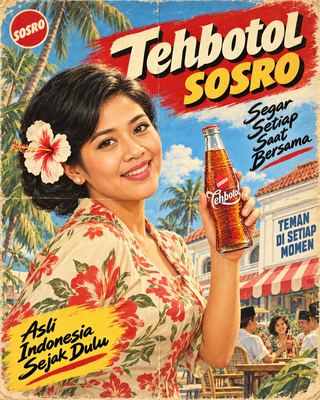
Edit the uploaded images into a brand-new, fully hand-painted 1960s Indonesian advertising poster illustration. Image 1 = the person (facial-identity reference ONLY). Image 2 (and Image 3 if provided) = the beverage product being advertised. Generate a new image: do not keep Image 1's background, pose, outfit, lighting, or pixel structure. Vertical 4:5 poster, authentic vintage mid-century Madison Avenue ad aesthetic with a nostalgic Indonesiana atmosphere.

PRODUCT + BRAND READING: Read the brand name, product name, flavor/variant, label wording, container type (bottle, can, carton, pouch, cup) and dominant colors directly from Image 2/3. Everything brand-related in this poster comes from the product and nothing is invented. Do not default to any other brand.

PRODUCT FIDELITY: The subject holds the EXACT product from Image 2/3 in the raised hand. Container shape, proportions, cap/lid, label layout, label wording, logo and colors are accurate: no distortion, no added or removed details, one label only. It is repainted in the poster's gouache style with frosty condensation droplets and glossy highlights, but must stay instantly recognizable as the uploaded product. A few small copies of the same product appear on the café table in the background.

FACIAL ANCHOR LOCK + SEAMLESS INTEGRATION: Face locked to Image 1 (bone structure, eye shape, nose, lips, jawline, skin tone) but repainted in the same gouache and soft-airbrush illustration language as the poster: smooth blended skin, defined brows and lashes, glossy lip color. It must never look like a pasted photo. Match lighting, skin tone and head angle to the new pose, blend hairline, jaw and neck naturally, with zero visible seam or cutout edge.

SUBJECT + POSE: The subject is large in the frame, filling about 55% of the canvas (left and center), waist-up, body turned three-quarters to the right, head turned back toward the viewer with a slight playful tilt. One hand is raised at shoulder height at the right, holding the product toward the viewer. Gender-neutral treatment: choose the cut that fits the subject.
- Hair (period costume restyle, natural hair color of Image 1 kept): voluminous glossy 1960s curled updo with soft side curls (female-presenting) or a neat pomaded 1960s side-part (male-presenting). A large white-and-red hibiscus is tucked at the ear, with a small pearl earring if suitable.
- Wardrobe: cream 1960s kebaya-style blouse (female-presenting) or short-sleeve open-collar camp shirt (male-presenting), in a bold floral batik-style print. Print colors harmonize with the product's palette on the color wheel but are not identical to it.

PALETTE: Derive [Color 1] and [Color 2] from the product's dominant label/packaging colors. [Color 1] = main banner color, [Color 2] = accent for the second headline line and the tagline swash. Support with warm cream and sky blue. A saturated yet slightly faded vintage grade: not sepia, not neon.

TYPOGRAPHY (hand-painted look, Indonesian copy, exact spelling):
- Top-left: round badge in [Color 1] holding the brand's own initial or symbol taken from the product label (replaces the "@").
- Top: slanted dry-brush banner in [Color 1] across the top quarter. The brand name exactly as printed on the product: first word in cream ultra-heavy italic caps with a thick black offset drop shadow, second word (or the product/variant name) on the line below in [Color 2] in the same style. If the brand is a single word, split it across the two lines by weight, or put the variant name on the second line.
- Right-middle: black hand-painted italic brush script tagline in four short stacked lines, with a brush underline stroke. Bottom-left: slanted [Color 2] brush-swash banner with black italic brush script in three short lines and an underline stroke. Right: white building signboard in slate-blue bold caps, three short lines.
- Copywriting: write the two taglines and the signboard slogan in warm 1960s Indonesian advertising voice (energetic, optimistic, communal), adapted to the drink type and flavor read from Image 2/3 and to any wording printed on the packaging. No health claims. Every word appears only once across all poster text blocks (banner, both taglines, signboard), with no repeated words or phrases. No other text.

ENVIRONMENT: Bright sky blue with painted clouds. Tall coconut palms along the left edge. At right, a two-storey colonial building with a terracotta roof and a red-and-white striped awning under the signboard. Bottom-right: a small, loosely painted open-air café scene with friendly anonymized figures at a wooden table (men in black peci caps and white shirts, one smiling woman), enjoying the product. No resemblance to real people.

LIGHTING: Warm sunny key light from the front-left, golden highlight on the cheek and product, soft shadow on the right side of the face, cinematic but painterly.

PRINT + PAPER TEXTURE: Authentic screen-print and gouache brushwork with visible soft brush strokes, airbrush gradients, fine halftone and stipple grain. Slight ink misregistration on the [Color 1] layer, tiny ink bleed on letter edges, aged cream paper with fine fibers, a vertical center fold crease plus faint secondary creases, yellowed worn edges, foxing specks and small scuffs. All of these imperfections must sit on the poster surface with micro-shadows following the poster's own lighting, never a flat pasted-on overlay. Avoid a clean, AI-polished look.

ANATOMY LOCK: Anatomically correct proportions, natural shoulder width. The product-holding hand has exactly 5 fingers with natural knuckles, the thumb has 2 joints, and the fingers grip the container naturally with plausible contact points.

EXPRESSION UNLOCK: The face is locked to the reference but the expression is free. A bright, joyful open smile showing the upper teeth, lifted cheeks, lively eyes glancing at the camera, a slight head tilt. Alive and excited, never stiff, blank or camera-posed.

NEGATIVE: (1) No pasted-on photographic face, visible seam at hairline/jaw/neck, or flat overlay-looking grain, creases or paper texture. (2) No altered, redesigned or generic product, no extra or missing fingers, distorted hand, warped or double container, garbled or misspelled text, repeated words, extra text, other brands' logos or watermark. (3) No sepia wash, no glossy 3D/CGI or modern ultra-clean digital look, no plastic skin, no neon colors.