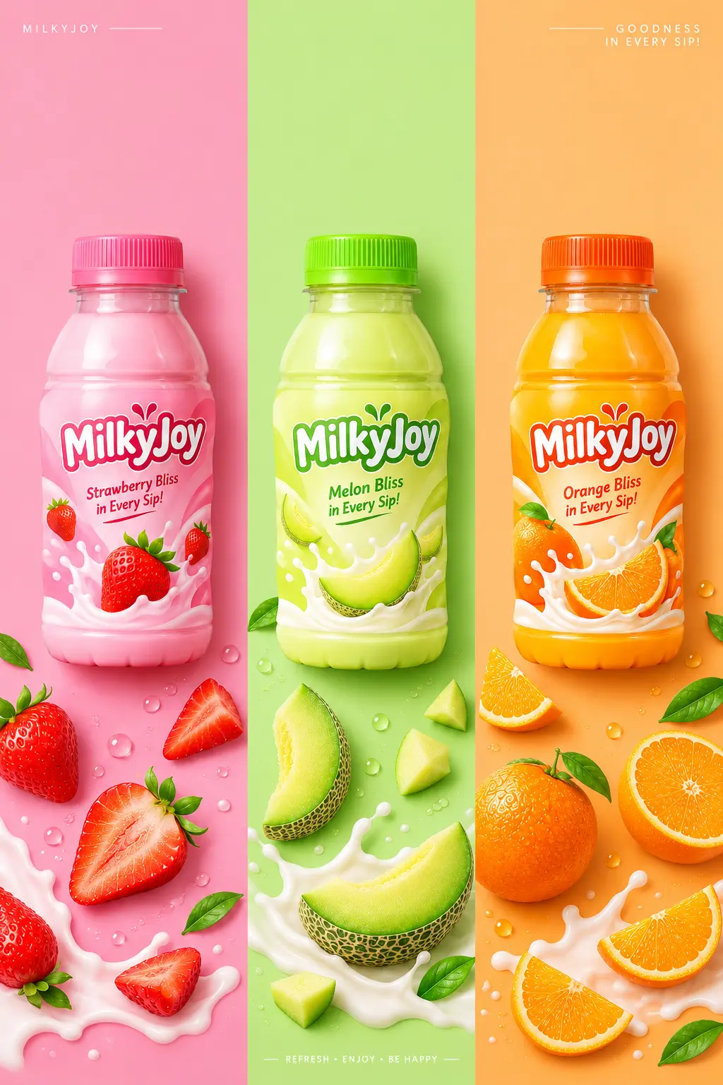
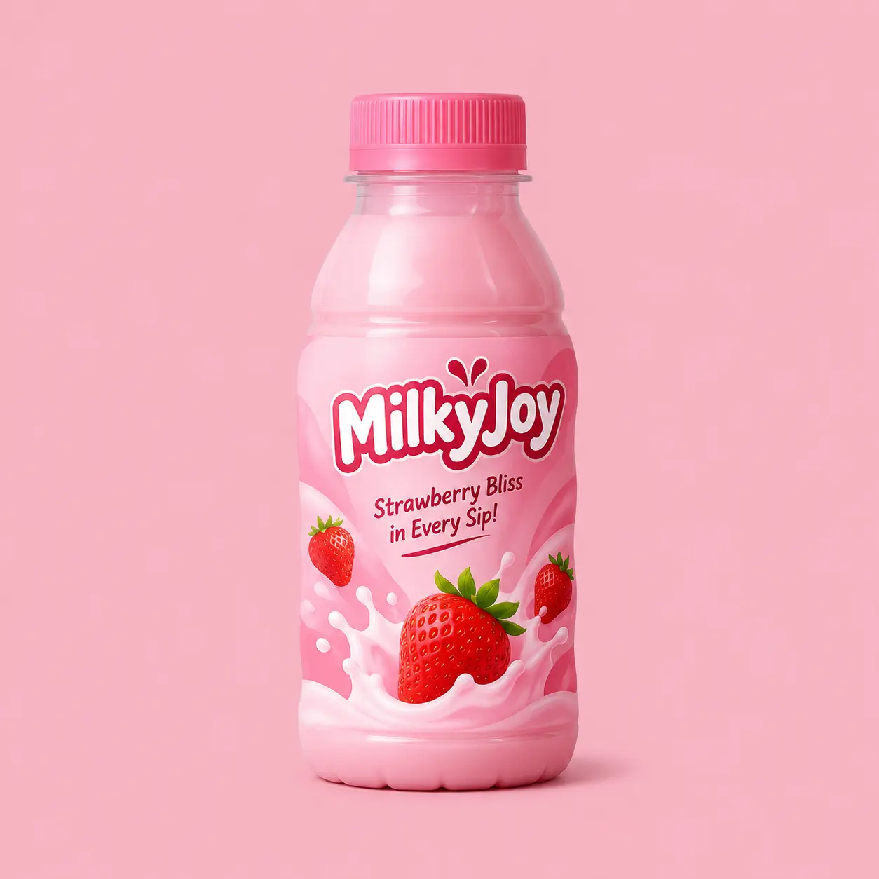
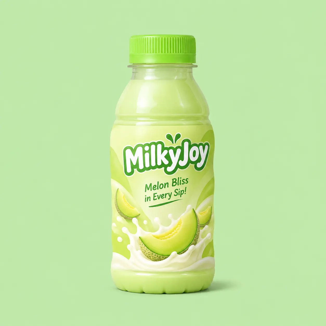
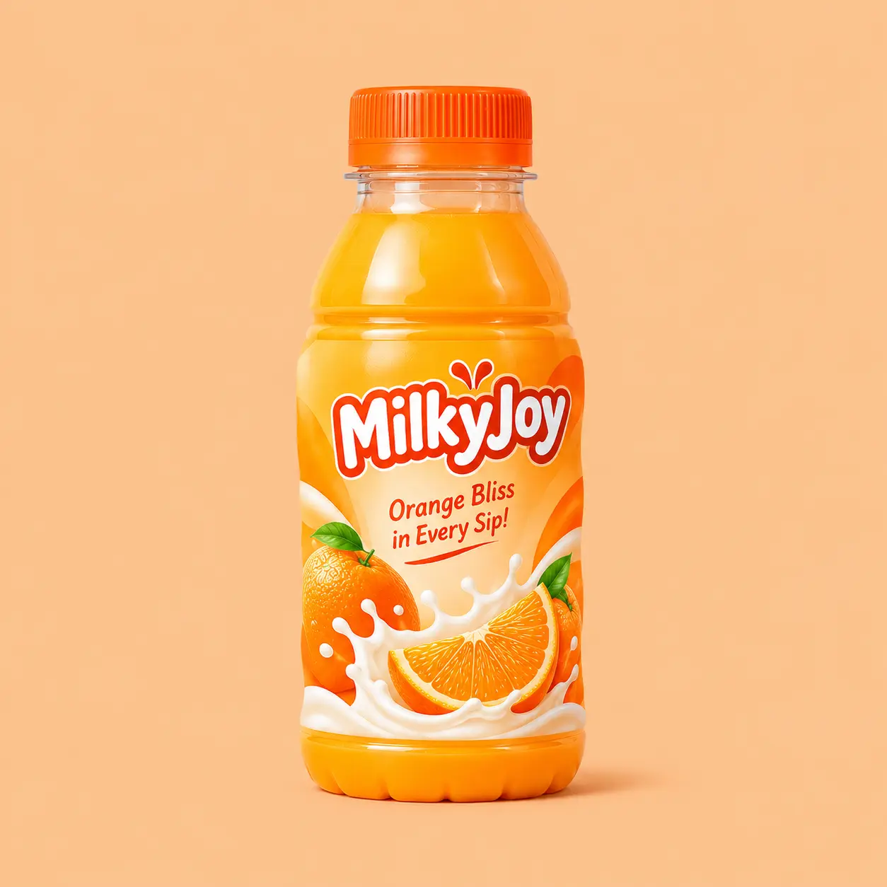
Edit the 3 uploaded product photos into ONE premium vertical beverage campaign poster (2:3 ratio). The 3 uploaded images are the 3 flavor variants of the same drink series. Follow the art direction written below.

STEP 1: ANALYZE THE UPLOADED PRODUCTS
Look at each of the 3 bottles and identify:
- the flavor of each one (read it from the label text, fruit illustrations, or product name)
- the dominant color of each label
Use this to drive every choice below. If a flavor is unclear, infer it from the label's colors and illustrations.

PRODUCT RULES (highest priority)
- Use the 3 bottles exactly as uploaded: same shape, cap, label design, colors, logo, and text. Do not redraw, restyle, rename, or invent new packaging.
- Keep all label text sharp, legible, and unchanged. No gibberish text.
- Cleanly cut out each bottle, then match its lighting and shadow to the new scene.

LAYOUT
- Split the poster into 3 equal vertical color panels with crisp straight edges and no gaps. One panel per flavor.
- One bottle per panel, centered horizontally in the upper-middle area (around 35-40% from the top), lying flat in a top-down (flat lay) view. All three bottles the same size, aligned on the same horizontal line.
- Leave generous clean negative space above the bottles. Scatter the ingredients mainly in the lower half of each panel, with the density increasing toward the bottom edge.

PANEL COLORS (automatic)
- For each panel, choose a flat, matte, solid background color that harmonizes with that bottle's label color and flavor (soft pastel or muted tones).
- The 3 panel colors must be clearly different from each other, yet look balanced together as one cohesive palette.
- Each bottle must stand out clearly against its panel (good contrast, no blending in).

INGREDIENTS (automatic)
- In each panel, scatter the real fresh ingredients that match that bottle's flavor (fruit, berries, leaves, nuts, spices, or anything shown on the label): whole, halved, sliced, and in pieces, at varied angles and sizes.
- Show only ingredients that match that panel's flavor. Never mix flavors between panels.
- A few pieces slightly overlap the panel edge or cross into the neighboring panel for a dynamic feel.
- Fresh, juicy, appetizing, realistic texture with subtle water droplets.

LIGHTING & STYLE
- Overhead commercial studio photography, soft diffused light from the top-left, gentle short realistic contact shadows under bottles and ingredients.
- Clean, bright, high-saturation but natural colors. Crisp focus across the whole frame.
- Modern, minimal, premium Asian beverage-branding aesthetic, like a high-end food and beverage ad.

DETAILS
- Add a thin minimalist typographic accent in the top corners (small, subtle, brand-neutral) and a tiny footer line at bottom center. Minimal text, perfectly spelled.
- No hands, no people, no extra bottles, no watermark, no distortion, no blur.

Output: ultra high resolution, print-quality poster.