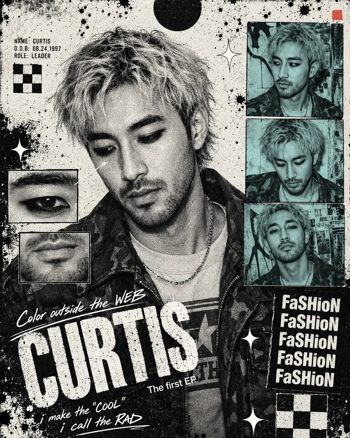
Create a 4:5 ratio K-pop editorial collage poster in the style of an underground punk zine / Y2K grunge fan-made EP cover. The overall aesthetic is raw, chaotic, and high-energy.

SUBJECT: Use the attached photo as the face reference. Maintain the subject's facial identity exactly — same facial structure, features, and likeness throughout.

WARDROBE & STYLING (replicate exactly):
- Outfit: dark oversized jacket (camouflage or military-pattern), layered over a light-colored graphic tee with a bold logo/stripe
- Accessories: thin chain necklace visible at the neck
- Hair: bleached/dirty-blonde medium-length hair, tousled and slightly wavy, unstyled raw look
- Makeup: heavy dark eyeliner on both upper and lower lids, no other visible makeup
- Expression: relaxed, slightly smiling or looking downward with soft expression

LAYOUT STRUCTURE:
- Center-left: a large full-bleed black-and-white portrait of the subject, converted to a halftone newsprint dot effect (visible coarse halftone dots, high contrast)
- Top-right: a stack of 3 rectangular color-photo thumbnails of the subject in different poses, all with a muted teal/cyan color wash (desaturated, slightly faded)
- Overlaid on the face: two small rectangular close-up inserts — one extreme close-up of the eye with eyeliner detail, one of the lower face/lips
- Bottom-left: overlapping bold text at a slight diagonal

TYPOGRAPHY (replicate all):
1. Large distressed/eroded bold condensed uppercase band name "CURTIS" in white, heavily textured and worn
2. Handwritten italic script "Color outside the WEB" in white above the band name
3. Small clean sans-serif text: "The first EP" in white
4. Left side: small clean sans-serif personal info block (name, birthday format XX.XX.2XXX, role: leader)
5. Right side: stacked bold deconstructed text "FaSHioN" repeated 5 times vertically, alternating cap/lowercase in the middle of the word, white on black
6. Bottom-left: italic script caption "i make the "COOL" / i call the RAD" in white

GRAPHIC ELEMENTS (include all):
- Large solid black circle at top-center
- 2×2 black-and-white checker pattern square (mid-left and bottom-right areas)
- 4-pointed diamond star shapes (white, decorative, scattered)
- Small red accent square (top-right corner area)
- Black ink splatter/bleed texture across background
- Thin diagonal line with small arrow pointer near face close-up insert

COLOR PALETTE:
- 85% black and white (near-monochromatic)
- Photo thumbnails: muted teal (#8ECFC0) color wash only
- One tiny red/pink accent square
- Background: off-white to white with black ink texture overlays

OVERALL FEEL: Looks like a photocopied zine, printed on newsprint, with layered collage elements that break the grid — raw, underground, intentionally lo-fi and distressed. Not polished or clean.

Output at 4:5 ratio (portrait orientation).