Aspect Ratio: 4:5

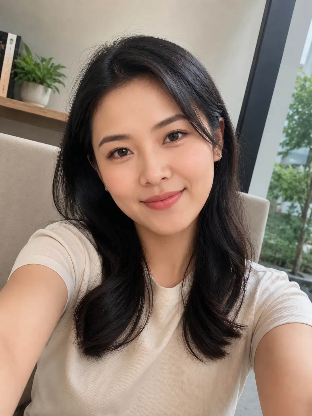
FACIAL ANCHOR LOCK: Use the uploaded photo as the exact facial reference. Keep the identity, face shape, and features 100% locked to the uploaded image — only the expression may shift naturally to fit the mood (calm, resolved, mid-motion). Never alter bone structure, eye shape, nose, lips, or skin tone from the reference.

CONCEPT & ANGLE:
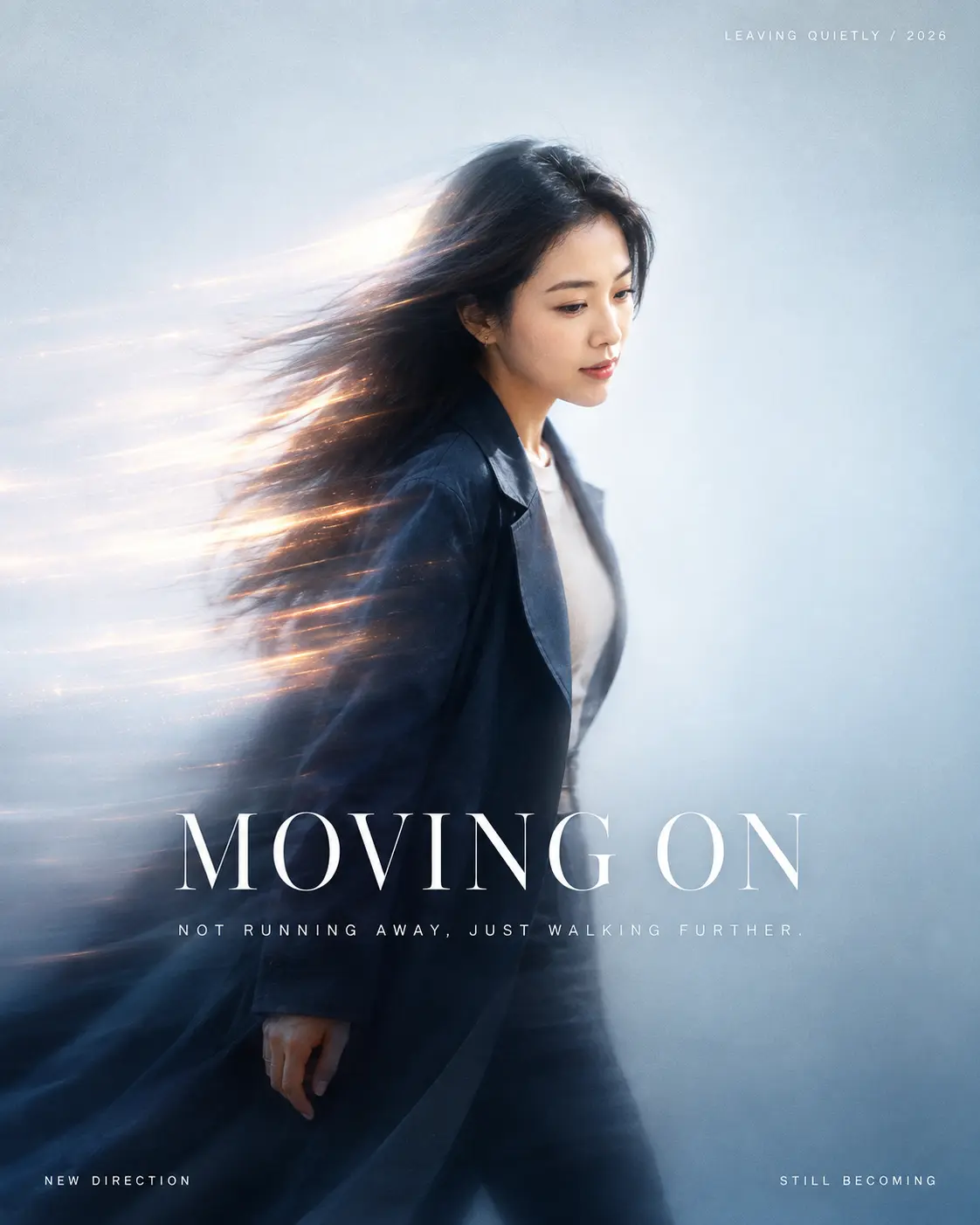
Generate a cinematic, dynamic motion-blur portrait of the subject from the uploaded photo, styled as if caught mid-stride walking forward — a visual metaphor for moving on. Match the reference composition exactly: the body is turned in a strong 3/4-to-near-profile angle, roughly 80% rotated to one side (mirror to whichever side suits the uploaded photo's original head/shoulder angle), walking purposefully in that direction. The head is turned in the same direction as the body — face angled forward along the walking line, chin slightly down, eyes looking ahead and slightly downward (not at the camera, not glancing back). The face and the front edge of the profile stay fully sharp and clearly readable, while the hair streams and the trailing side of the body/coat dissolve into long horizontal motion-blur streaks behind — exactly like the reference's wind-blown hair and light-trail coat edge, as if light is dragging the figure forward, away from something.

COLOR GRADING & PALETTE (match reference):
- Overall grade: cool, high-key, slightly desaturated blue-white atmosphere — like soft daylight through fog or glass, not a studio white.
- Base/background tone: pale cool blue-grey, almost silvery-white, with a gentle vignette of soft blue in the corners.
- Subject's coat/outfit: deep desaturated navy-to-charcoal, providing the darkest value anchor in the frame.
- Skin tone: kept warm and natural against the cool background — do not let skin shift blue.
- Accent color: warm amber/orange-gold streaks woven through the motion-blur trail (hair and coat edge), acting as the single saturated warm note against the cool base.
- Overall cool/warm tension: large cool base + small warm glowing accent, clean and dreamy, never muddy or grey-brown.

POST-PROCESSING / FINISH (match reference):
- Soft diffusion/glow overlay across the whole image, slightly lifting the blacks for a hazy, airy look.
- Fine, subtle film grain across the frame — visible but delicate, not heavy or vintage.
- Gentle lens halation/glow specifically along the motion-streak highlights.
- Slightly soft/low-contrast focus on the blurred areas and background, while the visible face area stays crisp and higher-contrast.
- No color banding, no harsh contrast, no heavy vignette darkening — keep the light, transparent, modern editorial finish of the reference.

BACKGROUND:
A single, seamless high-key atmospheric field with no visible environment or set — matching the reference's pure light-and-air backdrop. Motion streaks read as abstract light trails (not recognizable objects) sweeping horizontally and dissolving into the pale blue-white base.

COMPOSITION:
Very low information density — leave generous negative space in front of the subject's gaze/walking direction so the sense of forward motion can "breathe," same as the reference's open, airy framing.

TYPOGRAPHY — Cinematic Editorial Font Pairing:
- Core word: set in a high-contrast serif with thin hairlines and dramatic thick-thin strokes — a Didone/Bodoni-style display serif, the kind used on European art-house film posters and fashion magazine covers. Large scale, centered below the subject or near the visual center of gravity, normal (not wide) letter-spacing so it reads as an elegant title card:
  "MOVING ON"
- Supporting line underneath: thin-weight geometric sans-serif (light/thin cut), small size, wide letter-spacing (tracked out like film end-credits or a masthead subhead), tight line-height, centered:
  "NOT RUNNING AWAY, JUST WALKING FURTHER."
- Minimal corner labels: same thin tracked-out sans as the caption, very small size, all-caps, functioning like a magazine's running header/footer or a film's chapter marker:
  Top corner (opposite the walking direction): "LEAVING QUIETLY / 2026"
  Bottom-left corner: "NEW DIRECTION"
  Bottom-right corner: "STILL BECOMING"
Both type families stay pure white, sitting on top of the light mist like a clean interface layer — the serif title carries emotional weight like a film title card, the sans captions stay quiet and structural like editorial credit lines. Do not mix in any rounded, casual, or handwritten fonts.

ANATOMY LOCK (mandatory): Anatomically correct proportions throughout — 5 fingers per hand with natural knuckles, thumb with 2 visible joints, natural 1:7 head-to-body ratio, natural shoulder width, arms reaching to mid-thigh at rest. No fused or missing fingers, no warped limbs, even within the motion-blur areas.

SEAMLESS INTEGRATION: The uploaded face must never look pasted-on. Match lighting direction, skin tone, and head angle to the new pose; blend hairline, jaw, and neck naturally into the motion-blur hair with no visible cutout edge or seam.

EXPRESSION: Calm, resolved, quietly composed, gaze fixed ahead and slightly down in the direction of the body's turn — alive and natural, not stiff or mannequin-like.

NEGATIVE PROMPT: no extra limbs, no distorted or fused hands, no warped facial features, no low-resolution or blurry face (the face must stay sharp and identity-accurate — only hair and trailing body/fabric carry motion blur), no gaze turned back toward the camera, no frontal head-on angle, no warm-toned or orange-shifted skin from the background grade, no rounded/casual/handwritten fonts, no bold heavy sans for the core word — no flat/matte finish, no missing grain, no missing light halation on the streaks — no muddy/grey-brown color cast, no vintage film degradation, no cluttered or recognizable background objects — no incorrect proportions, no floating or disconnected body parts, no altered facial identity from the uploaded reference.

If any errors appear (extra fingers, distorted hands, warped body), fix using: "fix only the hands/body, do not alter the face.